




鸿蒙UI系统组件16——富文本编辑器(RichEditor)
 蓝亭书序
2026-11-04 13:37:20 发布
0 浏览 0 点赞 0 收藏
RichEditor是支持图文混排和文本交互式编辑的组件,通常用于响应用户的对于图文混合内容的输入操作,例如可以输入图片的评论区。下面针对RichEditor的基本使用做一个讨论。
👉🏻 创建一个RichEditor组件
创建一个RichEditor组件的方式有两种:a)不使用属性字符串构建RichEditor组件;b)使用属性字符串构建RichEditor。
⭐️ 不使用属性字符串构建方式接口定义如下:
RichEditor(value: RichEditorOptions)RichEditorOptions的类图一览如下:
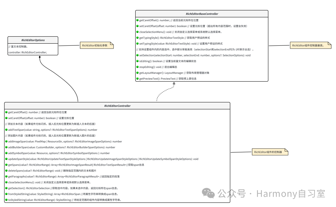
其中RichEditorOptions是富文本组件初始化选项。示例代码如下:
controller: RichEditorController = new RichEditorController();
options: RichEditorOptions = { controller: this.controller };

RichEditor(this.options)
    .onReady(() => {
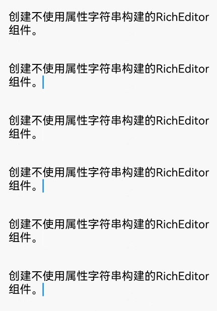
        this.controller.addTextSpan('创建不使用属性字符串构建的RichEditor组件。', {
            style: {
                fontColor: Color.Black,
                fontSize: 15
            }
        })
    })
示例代码对应的效果如下:
⭐️ 使用属性字符串构建方式接口定义如下:
RichEditor(options: RichEditorStyledStringOptions)RichEditorStyledStringOptions的类图一览如下:
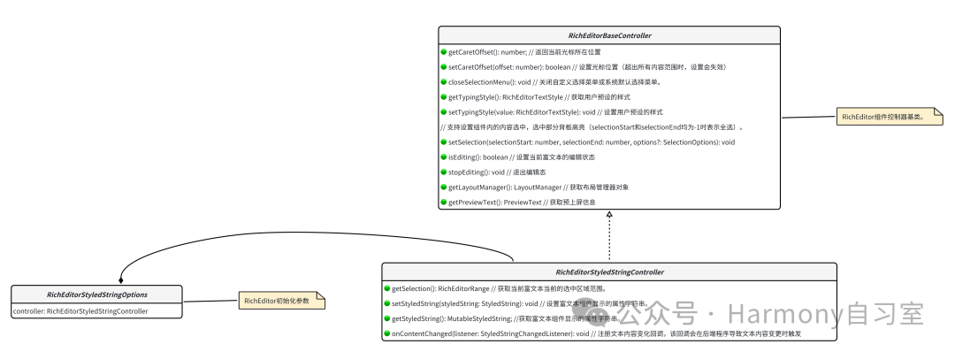
其中RichEditorStyledStringOptions是富文本组件初始化选项。示例代码如下:
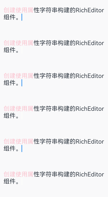
mutableStyledString: MutableStyledString = new MutableStyledString("创建使用属性字符串构建的RichEditor组件。",
    [{
        start: 0,
        length: 5,
        styledKey: StyledStringKey.FONT,
        styledValue: this.fontStyle
    }]);

controller: RichEditorStyledStringController = new RichEditorStyledStringController();
options: RichEditorStyledStringOptions = {controller: this.controller};

RichEditor(this.options)
    .onReady(() => {
        this.controller.setStyledString(this.mutableStyledString);
    })
实例代码对应的效果如下:
👉🏻 为RichEditor设置属性
⭐️ 设置自定义选择菜单
通过bindSelectionMenu设置自定义选择菜单,接口定义为:
bindSelectionMenu(
  spanType: RichEditorSpanType,
  content: CustomBuilder,
  responseType: ResponseType | RichEditorResponseType,
  options?: SelectionMenuOptions
)
// 涉及到的核心数据结构如下
enum RichEditorSpanType {
  TEXT = 0,  // Span为文字类型。
  IMAGE = 1,  // Span为图像类型。
  MIXED = 2,  // Span为图文混合类型。
  BUILDER = 3,  // Span为BuilderSpan类型。
}

enum RichEditorResponseType{
  LONG_PRESS  // 通过长按触发菜单弹出。
  RIGHT_CLICK  // 通过鼠标右键触发菜单弹出。
  SELECT  // 通过鼠标选中触发菜单弹出。
}

interface SelectionMenuOptions {
onAppear: MenuOnAppearCallback  //自定义选择菜单弹出时回调。
onDisappear: Callback<void>  //自定义选择菜单关闭时回调。
}

type MenuOnAppearCallback = (start: number, end: number) => void
其中:
- spanType是菜单的类型,默认值为文字类型;
- content是菜单的内容;
- responseType是菜单的响应类型,默认类型为长按;
- options是菜单的选项,可设置自定义选择菜单弹出或关闭时的回调。
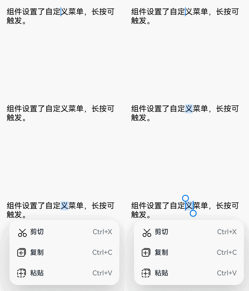
(自定义菜单超长时,建议内部嵌套Scroll组件使用,避免键盘被遮挡)示例代码如下:
RichEditor(this.options)
    .onReady(() => {
        this.controller.addTextSpan('组件设置了自定义菜单,长按可触发。', {
            style: {
                fontColor: Color.Black,
                fontSize: 18
            }
        })
    })
    .bindSelectionMenu(RichEditorSpanType.TEXT, this.SystemMenu, ResponseType.LongPress, {
        onDisappear: () => {
            this.sliderShow = false
        }
    })
    .width(300)
    .height(300)

@Builder
SystemMenu() {
    Column() {
            Menu() {
                    if (this.controller) {
                        MenuItemGroup() {
                            MenuItem({
                                startIcon: this.theme.cutIcon,
                                content: "剪切",
                                labelInfo: "Ctrl+X",
                            })
                            MenuItem({
                                startIcon: this.theme.copyIcon,
                                content: "复制",
                                labelInfo: "Ctrl+C"
                            })
                            MenuItem({
                                startIcon: this.theme.pasteIcon,
                                content: "粘贴",
                                labelInfo: "Ctrl+V"
                            })
                        }
                    }
                }
                .radius(this.theme.containerBorderRadius)
                .clip(true)
                .backgroundColor(Color.White)
                .width(this.theme.defaultMenuWidth)
        }
        .width(this.theme.defaultMenuWidth)
}
效果如下
⭐️ 设置光标和手柄颜色
添加文本内容,如果组件光标闪烁,插入后光标位置更新为新插入文本的后面,返回值为添加完成的TextSpan所在的位置。接口定义如下:
addTextSpan(value: string, options?: RichEditorTextSpanOptions): number
// options涉及的接口定义如下:
interface RichEditorTextSpanOptions {
  offset: number //添加文本的位置。省略时,添加到所有内容的最后。当值小于0时,放在所有内容最前面;当值大于所有内容长度时,放在所有内容最后面。
  style: RichEditorTextStyle // 文本样式信息。省略时,使用系统默认文本信息。
  paragraphStyle: RichEditorParagraphStyle //段落样式。
  gesture: RichEditorGesture // 行为触发回调。省略时,仅使用系统默认行为。
}
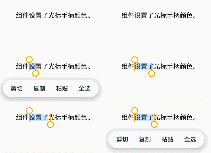
示例:通过caretColor设置输入框光标、手柄颜色。
RichEditor(this.options)
    .onReady(() => {
        this.controller.addTextSpan('组件设置了光标手柄颜色。', {
            style: {
                fontColor: Color.Black,
                fontSize: 15
            }
        })
    })
    .caretColor(Color.Orange)
    .width(300)
    .height(300)
效果如下:
⭐️ 设置空态提示文本(placeholder)
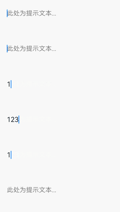
通过placeholder设置无输入时的提示文本。
其中value为无输入时的提示文本;style为添加提示文本的字体样式,style缺省时默认跟随主题。
RichEditor(this.options)
    .placeholder("此处为提示文本...", {
        fontColor: Color.Gray,
        font: {
            size: 15,
            weight: FontWeight.Normal,
            family: "HarmonyOS Sans",
            style: FontStyle.Normal
        }
    })
    .width(300)
    .height(300)
效果如下:
👉🏻 为RichEditor添加事件
⭐️ 初始化完成后的回调
通过onReady来添加组件初始化完成后可触发的回调。示例代码如下:
RichEditor(this.options)
    .onReady(() => {
        this.controller.addTextSpan('onReady回调内容是组件内预置文本。', {
            style: {
                fontColor: Color.Black,
                fontSize: 15
            }
        })
    })
⭐️ 内容被选中时的回调
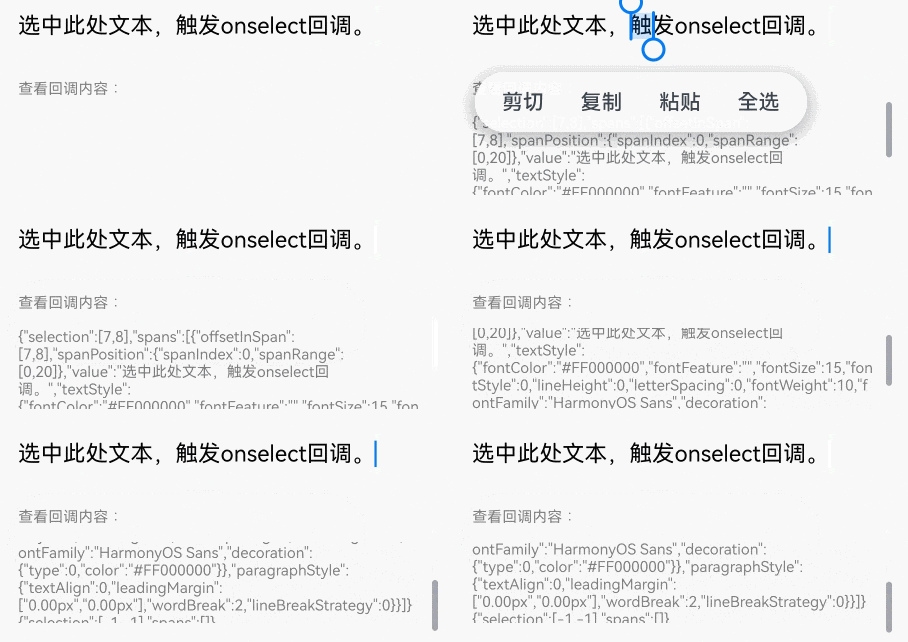
通过onSelect来添加组件内容被选中时可触发的回调。(触发该回调有两种方式:可通过鼠标左键按下选择,松开左键后触发回调,也可通过手指选择,松开手指触发回调)
RichEditor(this.options)
    .onReady(() => {
        this.controller.addTextSpan('选中此处文本,触发onselect回调。', {
            style: {
                fontColor: Color.Black,
                fontSize: 15
            }
        })
    })
    .onSelect((value: RichEditorSelection) => {
        this.controller1.addTextSpan(JSON.stringify(value), {
            style: {
                fontColor: Color.Gray,
                fontSize: 10
            }
        })
    })
    .width(300)
    .height(50)
Text('查看回调内容:').fontSize(10).fontColor(Color.Gray).width(300)
RichEditor(this.options1)
    .width(300)
    .height(70)
效果如下:
⭐️ 图文变化前 / 后的回调
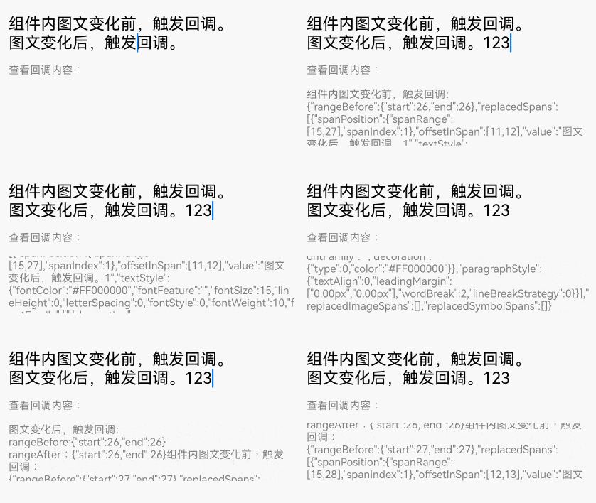
通过onWillChange添加图文变化前可触发的回调。通过onDidChange添加图文变化后可触发的回调。
- onWillChange的callback中:RichEditorChangeValue为图文变化信息;boolean为true时,表示当前图文允许被更改。boolean为false时,表示当前图文不允许被更改。
- onDidChange的callback中:OnDidChangeCallback为图文变化前后的内容范围。
【使用RichEditorStyledStringOptions构建的RichEditor不支持这两种回调】
RichEditor(this.options)
    .onReady(() => {
        this.controller.addTextSpan('组件内图文变化前,触发回调。\n图文变化后,触发回调。', {
            style: {
                fontColor: Color.Black,
                fontSize: 15
            }
        })
    })
    .onWillChange((value: RichEditorChangeValue) => {
        this.controller1.addTextSpan('组件内图文变化前,触发回调:\n' + JSON.stringify(value), {
            style: {
                fontColor: Color.Gray,
                fontSize: 10
            }
        })
        return true;
    })
    .onDidChange((rangeBefore: TextRange, rangeAfter: TextRange) => {
        this.controller1.addTextSpan('\n图文变化后,触发回调:\nrangeBefore:' + JSON.stringify(rangeBefore) + '\nrangeAfter:' + JSON.stringify(rangeBefore), {
            style: {
                fontColor: Color.Gray,
                fontSize: 10
            }
        })
        return true;
    })
    .width(300)
    .height(50)
Text('查看回调内容:').fontSize(10).fontColor(Color.Gray).width(300)
RichEditor(this.options1)
    .width(300)
    .height(70)
效果如下:
⭐️ 输入法输入前和完成输入后的回调
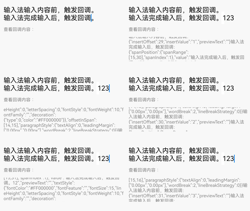
通过aboutToIMEInput添加输入法输入内容前可触发的回调。通过onIMEInputComplete添加输入法完成输入后可触发的回调。
- aboutToIMEInput的callback中:RichEditorInsertValue为输入法将要输入内容信息;boolean为true时,组件执行添加内容操作。boolean为false时,组件不执行添加内容操作。
- onIMEInputComplete的callback中:RichEditorTextSpanResult为输入法完成输入后的文本Span信息。
【使用RichEditorStyledStringOptions构建的RichEditor组件不支持这两种回调】
RichEditor(this.options)
          .onReady(() => {
            this.controller.addTextSpan('输入法输入内容前,触发回调。\n输入法完成输入后,触发回调。' , {
              style: {
                fontColor: Color.Black,
                fontSize: 15
              }
            })
          })
          .aboutToIMEInput((value: RichEditorInsertValue) => {
            this.controller1.addTextSpan('输入法输入内容前,触发回调:\n'+JSON.stringify(value), {
              style: {
                fontColor: Color.Gray,
                fontSize: 10
              }
            })
            return true;
          })
          .onIMEInputComplete((value: RichEditorTextSpanResult) => {
            this.controller1.addTextSpan('输入法完成输入后,触发回调:\n'+ JSON.stringify(value), {
              style: {
                fontColor: Color.Gray,
                fontSize: 10
              }
            })
            return true;
          })
          .width(300)
          .height(50)
Text('查看回调内容:').fontSize(10).fontColor(Color.Gray).width(300)
RichEditor(this.options1)
    .width(300)
    .height(70)
效果如下:
⭐️ 完成粘贴前触发的回调
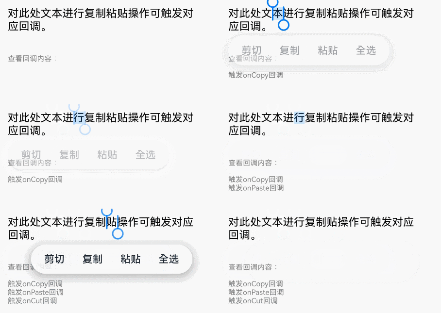
通过onPaste添加完成粘贴前可触发的回调【由于系统的默认粘贴,只支持纯文本的粘贴。所以我们可以通过该方法,覆盖系统默认行为,实现图文的粘贴】
RichEditor(this.options)
    .onReady(() => {
        this.controller.addTextSpan('对此处文本进行复制粘贴操作可触发对应回调。', {
            style: {
                fontColor: Color.Black,
                fontSize: 15
            }
        })
    })
    .onPaste(() => {
        this.controller1.addTextSpan('触发onPaste回调\n', {
            style: {
                fontColor: Color.Gray,
                fontSize: 10
            }
        })
    })
    .width(300)
    .height(70)
⭐️ 完成剪切前触发的回调
通过onCut添加完成粘贴前可触发的回调【由于系统的默认剪切行为,只支持纯文本的剪切。所以我们可以通过该方法,覆盖系统默认行为,实现图文的剪切】
RichEditor(this.options)
    .onReady(() => {
        this.controller.addTextSpan('对此处文本进行复制粘贴操作可触发对应回调。', {
            style: {
                fontColor: Color.Black,
                fontSize: 15
            }
        })
    })
    .onCut(() => {
        this.controller1.addTextSpan('触发onCut回调\n', {
            style: {
                fontColor: Color.Gray,
                fontSize: 10
            }
        })
    })
    .width(300)
    .height(70)
⭐️ 完成复制前触发的回调
通过onCopy添加完成粘贴前可触发的回调【由于系统的默认复制行为,只支持纯文本的复制。所以我们可以通过该方法,覆盖系统默认行为,实现图文的复制】
RichEditor(this.options)
    .onReady(() => {
        this.controller.addTextSpan('对此处文本进行复制粘贴操作可触发对应回调。', {
            style: {
                fontColor: Color.Black,
                fontSize: 15
            }
        })
    })
    .onCopy(() => {
        this.controller1.addTextSpan('触发onCopy回调\n', {
            style: {
                fontColor: Color.Gray,
                fontSize: 10
            }
        })
    })
    .width(300)
    .height(70)
效果如下:
👉🏻 为RichEditor设置用户预设样式
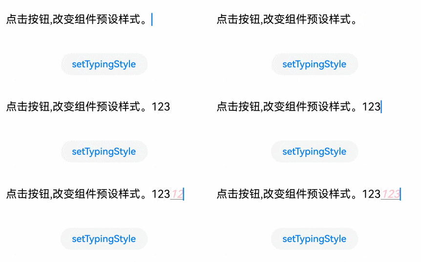
通过setTypingStyle设置用户预设的样式(其中value是预设样式)。示例如下:
RichEditor(this.options)
    .onReady(() => {
        this.controller.addTextSpan('点击按钮,改变组件预设样式。', {
            style: {
                fontColor: Color.Black,
                fontSize: 15
            }
        })
    })
    .width(300)
    .height(60)
Button('setTypingStyle', {
        buttonStyle: ButtonStyleMode.NORMAL
    })
    .height(30)
    .fontSize(13)
    .onClick(() => {
        this.controller.setTypingStyle({
            fontWeight: 'medium',
            fontColor: Color.Pink,
            fontSize: 15,
            fontStyle: FontStyle.Italic,
            decoration: {
                type: TextDecorationType.Underline,
                color: Color.Gray
            }
        })
    })
效果如下:
👉🏻 为RichEditor设置背板高亮
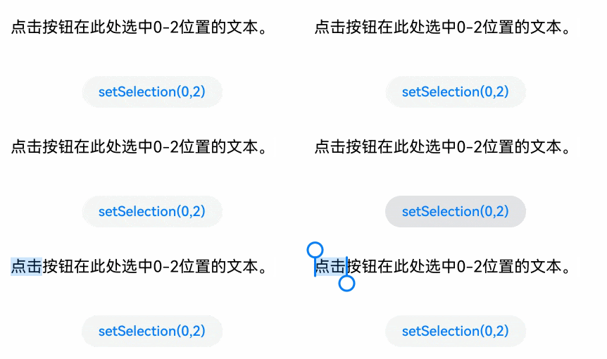
通过setSelection设置组件内的内容选中时部分背板高亮(其中selectionStart为选中开始位置,selectionEnd选中结束位置。当selectionStart和selectionEnd均为-1时表示全选,当组件内未获焦出现光标时,调用该接口不产生选中效果)
RichEditor(this.options)
    .onReady(() => {
        this.controller.addTextSpan('点击按钮在此处选中0-2位置的文本。', {
            style: {
                fontColor: Color.Black,
                fontSize: 15
            }
        })
    })
    .width(300)
    .height(60)
Button('setSelection(0,2)', {
        buttonStyle: ButtonStyleMode.NORMAL
    })
    .height(30)
    .fontSize(13)
    .onClick(() => {
        this.controller.setSelection(0, 2)
    })
效果如下:
👉🏻 添加文本内容
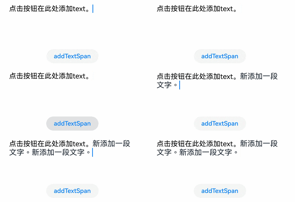
除了直接在组件内输入内容,也可以通过addTextSpan添加文本内容【其中value是文本内容;options是文本选项,用于添加文本的偏移位置和文本样式信息(RichEditorTextSpanOptions), 如果组件光标闪烁,插入后光标位置更新为新插入文本的后面】
RichEditor(this.options)
    .onReady(() => {
        this.controller.addTextSpan('点击按钮在此处添加text。', {
            style: {
                fontColor: Color.Black,
                fontSize: 15
            }
        })
    })
    .width(300)
    .height(100)
Button('addTextSpan', {
        buttonStyle: ButtonStyleMode.NORMAL
    })
    .height(30)
    .fontSize(13)
    .onClick(() => {
        this.controller.addTextSpan('新添加一段文字。')
    })
效果如下:
👉🏻 添加图片内容
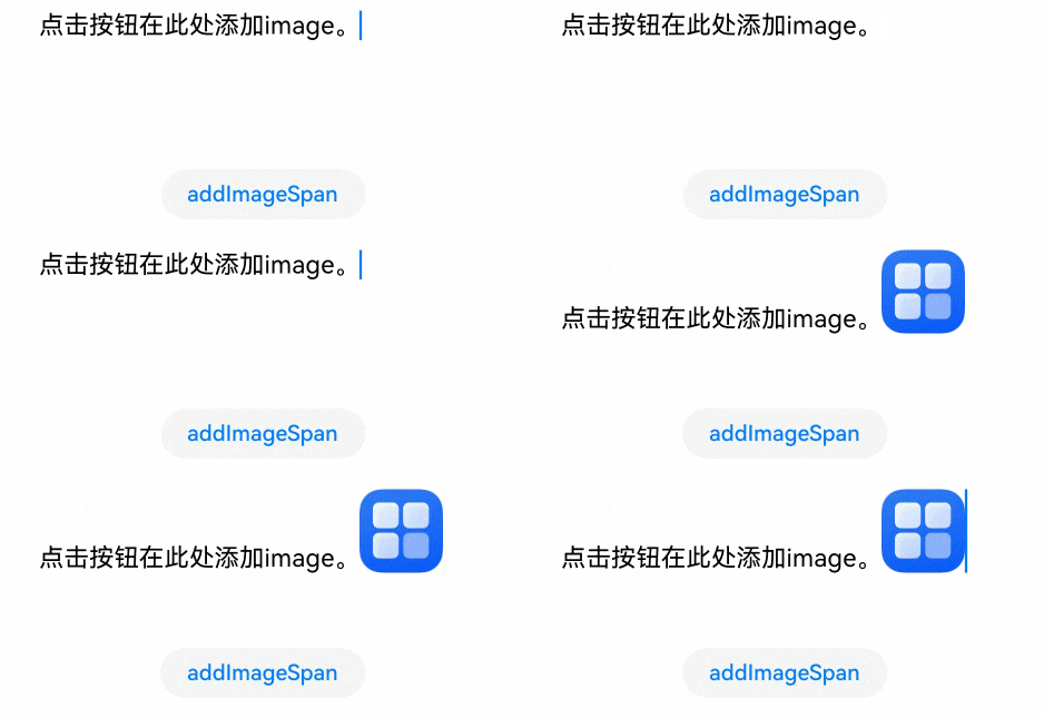
通过addImageSpan添加图片内容【其中value是图片内容;options是图片选项,用于添加图片的偏移位置和图片样式信息(RichEditorImageSpanOptions), 添加图片内容,如果组件光标闪烁,插入后光标位置更新为新插入图片的后面】
RichEditor(this.options)
    .onReady(() => {
        this.controller.addTextSpan('点击按钮在此处添加image。', {
            style: {
                fontColor: Color.Black,
                fontSize: 15
            }
        })
    })
    .width(300)
    .height(100)
Button('addImageSpan', {
        buttonStyle: ButtonStyleMode.NORMAL
    })
    .height(30)
    .fontSize(13)
    .onClick(() => {
        this.controller.addImageSpan($r("app.media.startIcon"), {
            imageStyle: {
                size: ["57px", "57px"]
            }
        })
    })
效果如下:
👉🏻 添加Builder内容
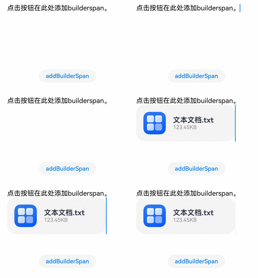
通过addBuilderSpan添加builder内容【其中value是builder内容;options是builder选项,可通过RichEditorBuilderSpanOptions设置此builder在RichEditor中的index(一个文字为一个单位)】
@Builder
TextBuilder() {
    Row() {
            Image($r('app.media.startIcon')).width(50).height(50).margin(16)
            Column() {
                Text("文本文档.txt").fontWeight(FontWeight.Bold).fontSize(16)
                Text("123.45KB").fontColor('#8a8a8a').fontSize(12)
            }.alignItems(HorizontalAlign.Start)
        }.backgroundColor('#f4f4f4')
        .borderRadius("20")
        .width(220)
}

Button('addBuilderSpan', {
        buttonStyle: ButtonStyleMode.NORMAL
    })
    .height(30)
    .fontSize(13)
    .onClick(() => {
        this.my_builder = () => {
            this.TextBuilder()
        }
        this.controller.addBuilderSpan(this.my_builder)
    })
效果如下:
👉🏻 添加SymbolSpan内容
可通过addSymbolSpan添加SymbolSpan内容【其中value是SymbolSpan组件内容;options是SymbolSpan组件选项,用于添加SymbolSpan组件的偏移位置和SymbolSpan组件样式信息( RichEditorSymbolSpanOptions ),添加SymbolSpan内容,如果组件光标闪烁,插入后光标位置更新为新插入Symbol的后面】
RichEditor(this.options)
    .onReady(() => {
        this.controller.addTextSpan('点击按钮在此处添加symbol。', {
            style: {
                fontColor: Color.Black,
                fontSize: 15
            }
        })
    })
    .width(300)
    .height(100)
Button('addSymbolSpan', {
        buttonStyle: ButtonStyleMode.NORMAL
    })
    .height(30)
    .fontSize(13)
    .onClick(() => {
        this.controller.addSymbolSpan($r("sys.symbol.basketball_fill"), {
            style: {
                fontSize: 30
            }
        })
    })
效果如下:

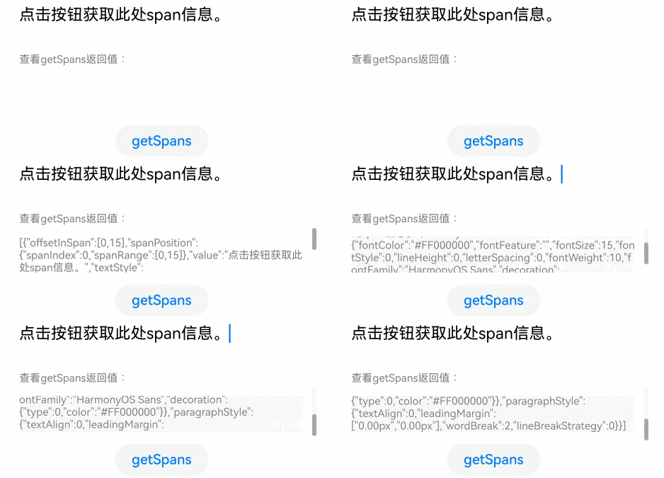
👉🏻 获取组件内span信息
可通过getSpans获取组件内span信息【其中value是需要获取span范围。返回值为Array
RichEditor(this.options)
    .onReady(() => {
        this.controller.addTextSpan('点击按钮获取此处span信息。', {
            style: {
                fontColor: Color.Black,
                fontSize: 15
            }
        })
    })
    .width(300)
    .height(50)
Text('查看getSpans返回值:').fontSize(10).fontColor(Color.Gray).width(300)
RichEditor(this.options1)
    .width(300)
    .height(50)
Button('getSpans', {
        buttonStyle: ButtonStyleMode.NORMAL
    })
    .height(30)
    .fontSize(13)
    .onClick(() => {
        this.controller1.addTextSpan(JSON.stringify(this.controller.getSpans()), {
            style: {
                fontColor: Color.Gray,
                fontSize: 10
            }
        })

    })
效果如下:
©本站发布的所有内容,包括但不限于文字、图片、音频、视频、图表、标志、标识、广告、商标、商号、域名、软件、程序等,除特别标明外,均来源于网络或用户投稿,版权归原作者或原出处所有。我们致力于保护原作者版权,若涉及版权问题,请及时联系我们进行处理。
分类
HarmonyOS
标签
RichEditor
UI系统组件
相关推荐
鸿蒙跨设备协同开发02——RichEditor跨设备获取文件
蓝亭书序 0
 0
鸿蒙跨设备协同开发01——跨设备获取照片
蓝亭书序 0 0华为鸿蒙走进企查查研发总部,企查查加快数据产品研发
 向阳yyy 0 0
从技术突破到产业共生,鸿蒙生态进入价值释放期
 xingxing 0 0
鸿蒙星光盛典将于12月5日举行,讲述中国操作系统的成长与共创
time 112 0 蓝亭书序
我还没有写个人简介......
75
帖子
0
提问
236
粉丝
最新发布
鸿蒙跨设备协同开发02——RichEditor跨设备获取文件
2026-11-04 13:37:56 发布鸿蒙UI系统组件16——富文本编辑器(RichEditor)
2026-11-04 13:37:20 发布热门推荐
相关问题
 京公网安备:11010502051901号