




鸿蒙UI开发——组件裁剪与遮罩
 蓝亭书序
2026-11-18 13:26:53 发布
0 浏览 0 收藏
1、概 述
ArkUI为组件提供了裁剪和遮罩功能,我们可以实现更多样话的UI效果。下面针对裁剪和遮罩功能做介绍。
2、裁 剪
裁剪分为两种:1、父容器对子组件进行裁剪;2、直接对组件进行裁剪。
2.1、 父容器对子容器进行裁剪
如果我们希望子组件不超出父容器,超出部分做裁剪处理,可以使用此能力,接口定义如下:
// 是否对当前组件的子组件进行裁剪。默认值false
clip(value: boolean)
一个裁剪效果如下:
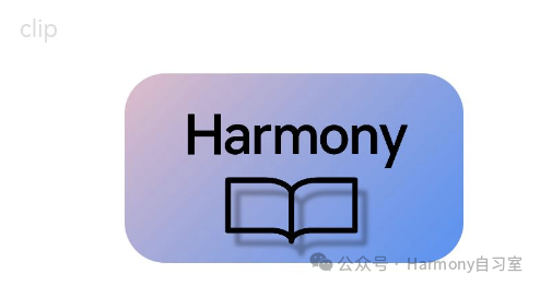
代码如下(11 ~ 12行):
// xxx.ets
@Entry
@Component
struct Index {
  build() {
    Column({ space: 15 }) {
      Text('clip').fontSize(12).width('75%').fontColor('#DCDCDC')
      Row() {
        Image($r('app.media.harmony_class_room')).width('500px').height('280px')
      }
      .clip(true) // 如这里不设置clip为true,则Row组件的圆角不会限制其中的Image组件,Image组件的四个角会超出Row
      .borderRadius(20)
    }
    .width('100%')
    .margin({ top: 15 })
  }
}
2.2、 直接对组件进行裁剪
如果我们有组件想直接对其进行裁剪效果处理,可以考虑使用此能力,接口定义如下:
// 按指定的形状对当前组件进行裁剪。
clipShape(value: CircleShape | EllipseShape | PathShape | RectShape)
当前形状支持四种,分别定义如下:
struct ShapeSize {
   width: number | string,  //  形状的宽度。
   height: number | string, //   形状的高度。
}

struct CircleShape {
   options: ShapeSize;
}

struct EllipseShape {
   options: ShapeSize;
}

struct PathShape {
   options: PathShapeOptions; // 结构定义如下
}

struct PathShapeOptions {
   commands: string // 绘制路径的指令。
}

struct RectShape {
    // 矩形形状参数。
   options: RectShapeOptions | RoundRectShapeOptions
}

struct RectShapeOptions extends ShapeSize {
   // 矩形形状的圆角半径。
   radius: number | string | Array<number | string>
}

struct RoundRectShapeOptions extends ShapeSize {
   radiusWidth: number | string, //  矩形形状圆角半径的宽度。
   radiusHeight: number | string, //  矩形形状圆角半径的高度。
}
一个裁剪效果如下:
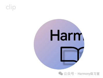
代码如下(10行):
// xxx.ets
@Entry
@Component
struct Index {
  build() {
    Column({ space: 15 }) {
      Text('clip').fontSize(12).width('75%').fontColor('#DCDCDC')
      // 用一个280px直径的圆对图片进行裁剪
      Image($r('app.media.harmony_class_room'))
        .clipShape(new Circle({ width: '280px', height: '280px' }))
        .width('500px').height('280px')
    }
    .width('100%')
    .margin({ top: 15 })
  }
}
3、遮罩
遮罩主要涉及以下几个API:
3.1、 为组件添加可调节进度的遮罩
接口定义如下:
// 为组件上添加可调节进度的遮罩。ProgressMask用于设置遮罩的进度、最大值和遮罩颜色。
mask(value: ProgressMask)

// ProgressMask定义如下:
class ProgressMask {
   value: number, // 进度遮罩的当前值。
   total: number, // 进度遮罩的最大值。
   color: ResourceColor, // 进度遮罩的颜色。
   constructor(value: number, total: number, color: ResourceColor);

   // 一些更新方法
   updateProgress(value: number): void;
   updateColor(value: ResourceColor): void;
   // 进度满时的呼吸光晕动画开关。默认关闭呼吸光晕动画。
   enableBreathingAnimation(value: boolean): void;
}
一个示例效果如下(请注意达到100%时的展开动画,以及重置回去时的效果):
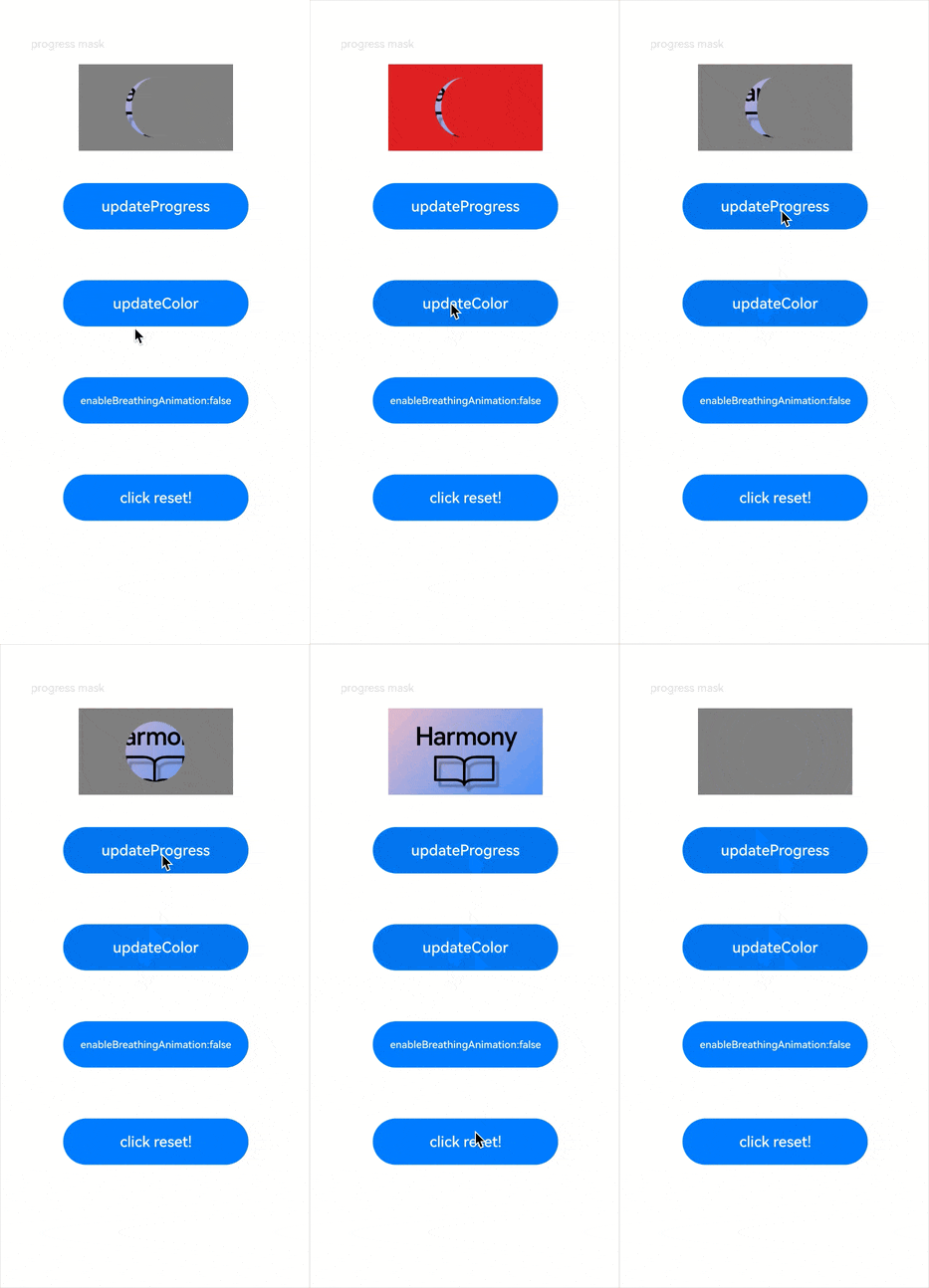
代码如下:
import { RectShape } from '@kit.ArkUI';

@Entry
@Component
struct ProgressMaskExample {
  @State progressflag1: boolean = true;
  @State color: Color = 0x01006CDE;
  @State value: number = 10.0;
  @State enableBreathingAnimation: boolean = false;
  @State progress: ProgressMask = new ProgressMask(10.0, 100.0, Color.Gray);

  build() {
    Column({ space: 15 }) {
      Text('progress mask').fontSize(12).width('75%').fontColor('#DCDCDC')
      // 给图片添加了一个280px*280px的进度遮罩
      Image($r('app.media.harmony_class_room'))
        .width('500px')
        .height('280px')
        .mask(this.progress)
        .animation({
          duration: 1000, // 动画时长
          curve: Curve.Linear, // 动画曲线
          delay: 0, // 动画延迟
          iterations: 1, // 播放次数
          playMode: PlayMode.Normal // 动画模式
        }) // 对Button组件的宽高属性进行动画配置

      // 更新进度遮罩的进度值
      Button('updateProgress')
        .onClick(() => {
          this.value += 10;
          this.progress.updateProgress(this.value);
        }).width(200).height(50).margin(20)

      // 更新进度遮罩的颜色
      Button('updateColor')
        .onClick(() => {
          if (this.progressflag1) {
            this.progress.updateColor(Color.Red);
          } else {
            this.progress.updateColor(Color.Gray);
          }
          this.progressflag1 = !this.progressflag1
        }).width(200).height(50).margin(20)

      // 开关呼吸光晕动画
      Button('enableBreathingAnimation:' + this.enableBreathingAnimation)
        .onClick(() => {
          this.enableBreathingAnimation = !this.enableBreathingAnimation
          this.progress.enableBreathingAnimation(this.enableBreathingAnimation);
        }).width(200).height(50).margin(20)

      // 恢复进度遮罩
      Button('click reset!')
        .onClick((event?: ClickEvent) => {
          this.value = 0;
          this.progress.updateProgress(this.value);
        }).width(200).height(50).margin(20)
    }
    .width('100%')
    .margin({ top: 15 })
  }
}
3.2、 为组件添加指定形状的遮罩
接口定义如下:
// 为组件上添加指定形状的遮罩。
// 其中CircleShape | EllipseShape | PathShape | RectShape在前文中有介绍
maskShape(value: CircleShape | EllipseShape | PathShape | RectShape)
一个示例效果如下:
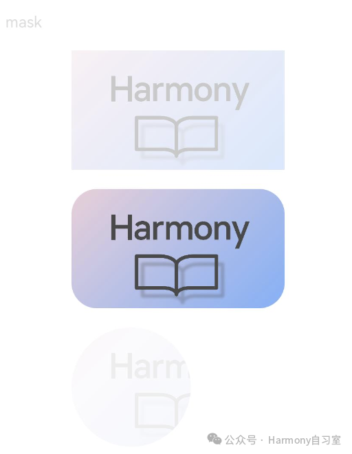
代码如下:
@Entry
@Component
struct ClipAndMaskExample {
  build() {
    Column({ space: 15 }) {
      Text('mask').fontSize(12).width('75%').fontColor('#DCDCDC')
      // 给图片添加了一个500px*280px的方形遮罩
      Image($r('app.media.harmony_class_room'))
        .maskShape(new Rect({ width: '500px', height: '280px' }).fill('#ff0000'))
        .width('500px').height('280px')

      // 给图片添加了一个500px*280px的方形遮罩
      Image($r('app.media.harmony_class_room'))
        .maskShape(new Rect({ width: '500px', height: '280px', radius: '60px' }).fill('#00ff00'))
        .width('500px').height('280px')

      // 给图片添加了一个280px*280px的圆形遮罩
      Image($r('app.media.harmony_class_room'))
        .maskShape(new Circle({ width: '280px', height: '280px' }).fill('#0000ff'))
        .width('500px').height('280px')
    }
    .width('100%')
    .margin({ top: 15 })
  }
}
©本站发布的所有内容,包括但不限于文字、图片、音频、视频、图表、标志、标识、广告、商标、商号、域名、软件、程序等,除特别标明外,均来源于网络或用户投稿,版权归原作者或原出处所有。我们致力于保护原作者版权,若涉及版权问题,请及时联系我们进行处理。
分类
HarmonyOS
标签
ArkUI
组件
UI
暂无评论数据
加载中...
发布
相关推荐
鸿蒙UI开发——上拉抽屉的更新与事件回调
蓝亭书序 0
 0
鸿蒙原生 Want 信息传递载体实战指南
 在人间耕耘 0 0
鸿蒙原生 Preferences C/C++ 数据持久化实战指南
在人间耕耘 0 0鸿蒙UI开发——实现一个上拉抽屉效果
蓝亭书序 0 0鸿蒙UI开发——Builder与LocalBuilder对比
蓝亭书序 0 0 蓝亭书序
我还没有写个人简介......
137
帖子
0
提问
236
粉丝
最新发布
鸿蒙多线程开发——Worker多线程
2026-11-04 14:22:24 发布鸿蒙多线程开发——TaskPool任务池
2026-11-04 14:21:14 发布热门推荐
23445 浏览
23030 浏览
20621 浏览
相关问题
 京公网安备:11010502051901号